AI扁平化插画绘画:简洁色块与几何造型的现代商业视觉设计
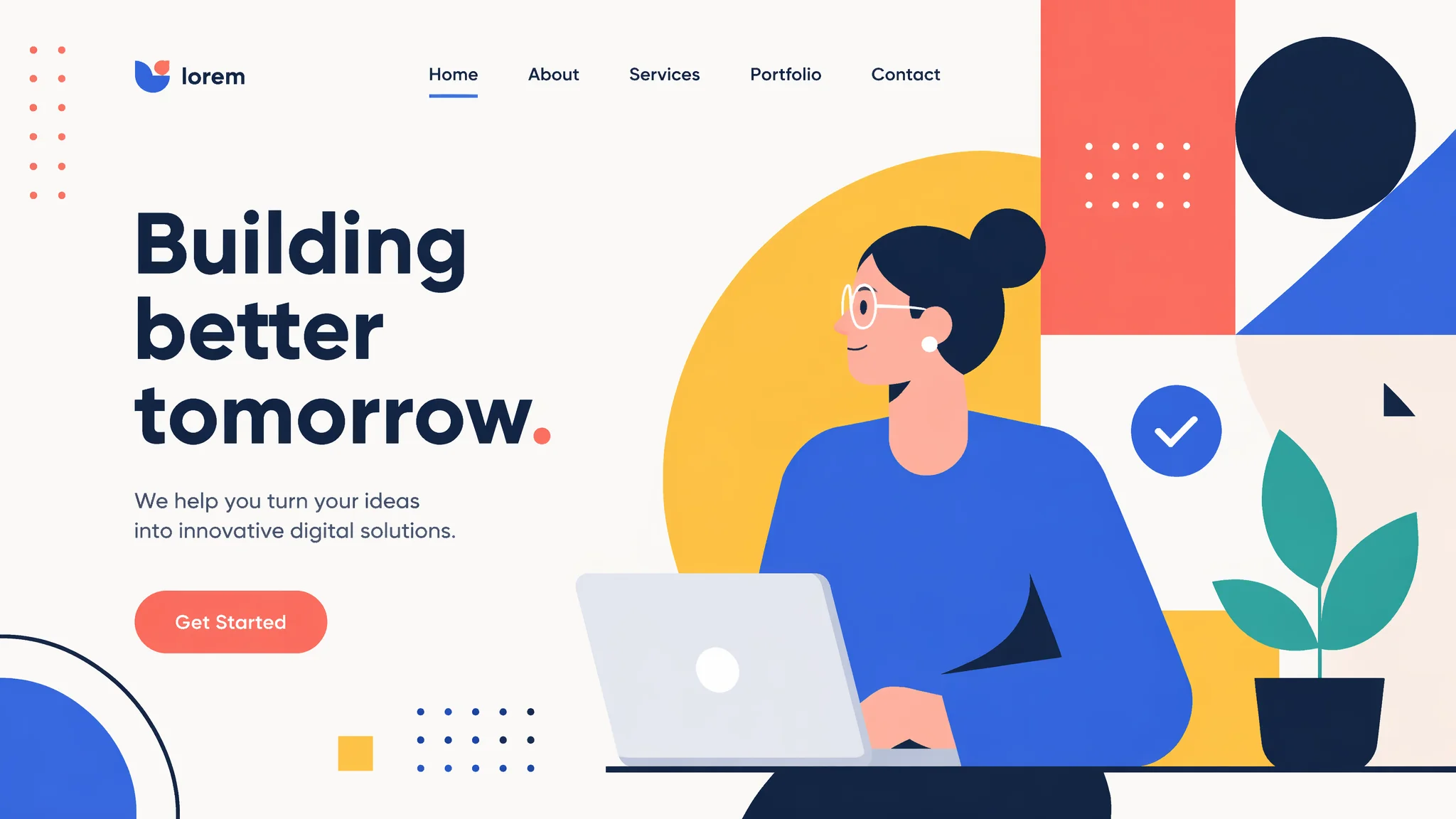
我有个甲方客户是做SaaS产品的——他们官网需要一套"科技感扁平插画"。第一次我让AI出图发过去,他回了一句:"这画风看着像幼儿园教材插图。"我仔细看了看——确实像。配色全是高饱和原色(红黄蓝绿像乐高积木一样堆在一起)、人物比例像火柴人、场景没有任何层次感——AI理解的"扁平"和我(以及甲方)理解的"扁平"之间有巨大的落差。后来我花了整整一周搞清楚怎么让AI产出"有设计感的扁平"而不是"简陋的扁平"——关键在色块层次、几何抽象度、配色策略和构图留白这四个维度。这套方法我已经在十几个商业项目里验证过了——从官网插图到APP引导页到产品宣传册——每次都稳定出图。
扁平化的"度"——从极度扁平到半扁平的六个抽象层级
不是所有"平"都一样平。AI绘画中扁平插画的抽象程度可以分六个层级——你需要根据实际需求选择停在哪个层级,而不是笼统地说"我要扁平风"。L1——纯剪影式:只有轮廓色块,无内部细节。"silhouette illustration——shapes filled with solid flat color, no internal lines, no texture, the image is readable purely through the outer contour of each shape"。适合图标和极简logo。
L2——色块+轮廓线:"flat illustration with clean uniform-weight outlines, shapes filled with solid flat colors, all internal details rendered as simple line work within the colored shapes, no gradients, no shadows"。适合UI插图和信息图表。L3——色块+微阴影:"flat illustration with minimal shading——a single darker tone for cast shadows that fall to the lower right of each object, the shadows are hard-edged geometric shapes not soft gradients, the overall look is still flat but with a subtle pop of dimensionality"。这是目前商业插画最流行的层级。L4——色块+纹理+微阴影:"flat illustration with added texture depth——the flat color blocks include subtle grain or noise textures, shadows use both hard-edged shapes and very minimal soft gradients at shadow edges"。L5——半扁平(semi-flat):"illustration that is fundamentally flat but with realistic lighting on key elements, the background and secondary elements remain flat while the main character has subtle volumetric shading"。L6——伪扁平(faux-flat):"illustration with the visual language of flat design (clean shapes, limited palette, geometric composition) but with realistic 3D rendering on surfaces and materials"。更多风格抽象层级的方法论见AI抽象几何绘画。选层级的关键问题是:"这套图将用在什么媒介上、和什么内容搭配、面向什么人群"——而不是"什么风格好看"。
人物扁平的几何简化——怎么让人物又"平"又有表现力
扁平人物插画最怕两种极端:一,简化的过头变成"安全出口标志小人"——全身都是直线和圆,完全没有个性。二,细节保留太多变成"普通插画压扁了"——有渐变有肌理,只是颜色少了点。好的扁平人物是"用最少的几何信息传达最大的个性"。
头部简化——"the head is an oval or rounded rectangle with simplified facial features——eyes are small dots or short horizontal lines (two dots for eyes, no pupils), eyebrows are simple curved lines that convey emotion through their angle, the nose is omitted or rendered as a tiny triangle or a single dot, the mouth is a short curved line"。头发简化——"hair is rendered as 2-3 large solid shapes with a few interior lines to indicate direction and parting, the hair shape defines the silhouette more than the face does"。身体简化——"the body is constructed from geometric primitives——the torso is a trapezoid or rounded rectangle, arms are simple elongated shapes that taper at the wrists, hands are simplified to mitten-like shapes with at most a line separating the thumb, legs are cylindrical shapes with simplified feet (shoes as colored blocks at the bottom)"。这些简化规则参考了Behance上大量商业扁平插画师的造型语言——你会发现头部简化到"两个点+一条线"依然可以传达强烈的情绪,因为情绪不靠五官细节——靠眉毛角度、头部倾斜、身体姿态。
场景构图——扁平插画的"层次感"靠的不是透视靠什么
写实插画的层次感来自透视和光影——近大远小、近实远虚。扁平插画放弃了透视——那层次感从哪来?一,前后遮挡——前景元素覆盖中景元素覆盖背景元素。"the composition has three depth layers built purely through overlap: foreground elements (a character and a plant in large scale at the bottom edge), midground elements (a building facade and a vehicle at medium scale), background elements (distant simplified buildings and clouds at small scale near the top of the frame)"。
二,色块对比度分层——前景用高对比度配色(亮色+重色),中景用中等对比度,背景用低对比度(类似色、低饱和度)。"color contrast decreases with depth——the foreground layer uses high-contrast color pairings (bright yellow against dark navy), the midground uses medium contrast, the background uses low-contrast pastel tones"。三,细节密度分层——前景物体的内部线条多、纹理多,背景物体几乎只有轮廓。"detail density decreases with depth——foreground objects have fine internal line work and texture, midground objects have simple internal divisions, background objects are pure silhouettes without any internal detail"。这三种技术合起来——不需要透视也能创造出清晰的空间深度。商业网站的扁平场景插画几乎全是用这三种技术做的。关于视觉层次感的更多设计原理见AI美学未来感照片——层次构建是跨风格的通用能力。
商业工作流——从甲方需求到批量交付的AI辅助流程
商业扁平插画的最大痛点不是"画不出一张好图"——是"画不出风格统一的三十张图"。风格一致性的问题在AI绘画中被放大了——因为AI的输出天然带有随机性。我整理了一套经过商业项目验证的工作流:第一步——创建风格锚点图。用最详细的Prompt生成一张"理想效果图"——这张图不一定要用在成品里,它的作用是锁定风格。
第二步——从锚点图提取风格参数。反向分析这张图的配色方案(取色5个主色+3个辅助色)、线条粗细、抽象层级、构图偏好——把这些定性特征写成"风格说明书"而不是Prompt。第三步——用风格说明书生成系列图。每一张新图的Prompt=风格说明书(固定不变)+该图的内容描述(可变)。第四步——质量检查清单。每张图检查:配色是否落在风格说明书的色板内、抽象层级是否一致、留白区域是否足够且位置正确、系列编号是否连续。第五步——统一后处理。用批处理给所有图统一添加微量的噪点纹理(0.5-1%强度的grain texture)——这个微妙的一致性细节会让整套图"看起来是一个系列"。
这个工作流我已经跑了半年——从之前一张一张地改Prompt碰运气,到现在半天能出一套20张的风格统一的商业插画。关于AI在商业视觉设计中的更多实战经验,AI小红书封面设计从社交媒体场景讲过类似的方法论——商业设计的核心永远是"一致性+效率"。另外参考Awwwards网站设计奖项里的扁平插画案例——商业趋势一直在变,看到了你才知道甲方下次会问你要什么。
常见问题
扁平插画的"留白"怎么做——AI老把画面塞得满满的?
AI默认会填满画布的每一个角落——因为训练数据中"好作品"通常是构图饱满的。强制留白的方法:"the composition uses deliberate negative space as a design element——at least 35% of the total canvas area is empty or filled with a single flat background color, the illustration elements are grouped in a single cluster occupying the center or lower portion, the empty space is not a mistake but a intentional breathing room that makes the illustration feel premium and editorial"。指定百分比(35%)比说"留一些空白"有效——因为AI对"一些"没有概念。
AI画的扁平人物"胳膊腿一样粗细"——怎么让体型有变化?
扁平人物最容易犯的比例错误是大腿=小腿粗细、上臂=前臂粗细——整条肢体像一根均粗的管子。修正方法:"the character's limbs have deliberate thickness variation——upper arms are 1.5 times thicker than forearms, thighs are noticeably fuller than calves, the waist is the narrowest point with the torso widening toward the shoulders, wrists and ankles are the thinnest points of the limbs"。把比例差写出来——"1.5倍"比"粗细有变化"管用得多。
想画"有中国味的扁平插画"——怎么避免画成"西方人眼中的中国风"?
AI训练数据中的"Chinese style"大多是西方视角的刻板印象集合——红灯笼+龙+金色。真正的中国味扁平插画需要指定具体的中国设计语言来源:"flat illustration inspired by Chinese paper-cutting art (Jianzhi)——bold connected shapes, negative space cutouts within solid color blocks, ornamental border patterns, limited to 2-3 colors"。或者:"flat illustration inspired by traditional Chinese blue-and-white porcelain pattern language——the illustration is entirely rendered in shades of cobalt blue on a white background, the shapes reference the organic flowing lines of porcelain decoration"。指定一个具体的中国传统艺术形式作为参考——而不是笼统的"Chinese style"。AI非遗文化绘画对这个话题有更系统的展开。